Description:
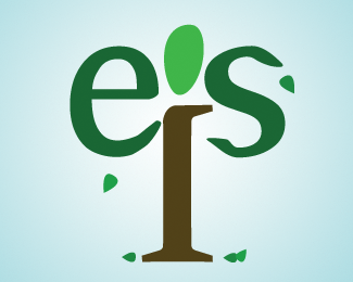
Working on a design for a data management program on campus. This is my first "real" attempt at this concept. People like the idea of a tree as a metaphor, though I worry people will think we're some eco-organization. Any suggestions on how to improve it?
Status:
Nothing set
Viewed:
476
Share:
Lets Discuss
Feels very heavy/handed (ie, forced), it doesn't read as %22eis%22 and it doesn't feel like a logo for data management. I was never a big fan of using and/or manipulating letters to create an illustration. I prefer my type to be type. You need to think about the function of the business or program that you're creating the logo for. People said %22tree%22 and you took it very literally and created a tree out of letters - but you have to ask yourself what the tree that you've designed has to do with data management? In my opinion, nothing. How about a tree made of pixels or a circuit board instead? Or a tree where the branches link to one another like a network does? Or do something with the roots of a tree. Do some research, THINK about the logo and physically SKETCH some thumbnail ideas before you execute it - you may surprise yourself.
ReplyPlease login/signup to make a comment, registration is easy