Description:
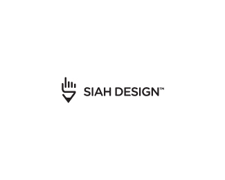
As a creative director I have the index finger showing direction with the bottom part of the hand being the pencil. The finger also has a lot of associations that come with it: One Way, Choose Siah Design, looking up, etc.
The significance of the finger pointing up for me though is that it is pointing up to God giving Him any credit for my work.
Mark also forms a monogram "S".
Copyright Josiah Jost and Siah Design © 2009
As seen on:
http://siahdesign.com
Status:
Client work
Viewed:
31592
Share:
Lets Discuss
this one is my favorite, looks really clean, good job
ReplyOh, this one is really good.
Replywow
Replymy favorite too.
Replycool One!
ReplyI totally enjoy how clean and simple looking this is. Very nice!
ReplyI'd agree this is the best of the batch.
ReplyHa! I recognized unconscious inspiration for this :) http://logopond.com/gallery/detail/52709
Reply@bojan If it was it was very unconscious :D
Reply:) yeah, no worries, it's like whateva you come up, mike's already has it in his portfolio :) lately i've been experiencing it constantly :) worst thing is when i see new logo uploaded that looks like almost identical to proposals i just sent to my client :) certainly very unpleasant situation...
ReplyBut seriously - this has so much power, no way you can forget this design... i think you mission is close to an happy end - throw in some siah type here and you got yourself very nice identity - unit, vag, chevin, agbook, omnes comes to mind... gotham rounded maybe?
ReplyThanks everyone! I'm starting to think this will be my new logo.**@bojan Thanks bud! I really respect your opinion.**I've added type people. It's a customized version of gotham rounded (thx for sugg. bojan). Thoughts?*
Replytry oneliner with perhaps intersecting letters or just plain vanila so it doesn't compete with icon imho
ReplyAbout damn time %3B)
ReplyClever and clean.
Replythat's awesome!
ReplyThx everyone!**@bojan: I don't think gotham rounded is going to work - I'm working on a custom type now. Cheers**
ReplyI do love it, but the hand seems to be waving, %22See ya!%22. That's how I pronounce your name, Siah. I have no idea how your named is really pronounced.
ReplyThx guys!**@theartistt: lol, my name is Josiah but my nickname since I was little is Siah. Pronounced 'Sigh-Ah'.**The hands have an actual deeper meaning to me then I shared at the top. I am a Christian and like to pray over all my designs. The hand is in the position of prayer as shown in old paintings, etc.** I know some of you might think that is weird but that's the way I feel about it and it's significant to me. :)
Replywell then, this is your logo then isn't it? you don't need us to validate it. although I know how great that is! faved and floated.
ReplyThanks @theartistt!**I just updated type! Thoughts everyone?
ReplyI think it's a little too condensed
Reply@Jared: Yea, I should have even uploaded that variation. I just did a custom type job on Stratum. I'm liking this more.. Your thoughts?
ReplyThis one is much better. The angles fit well with the shape of the mark, I think and it's soft enough to match the weight.
Replylogoholik%3E so it doesn't compete with icon imho**Very good point, because the type seems to be doing just that. I'd stick to a non-customized font, something like Etelka. The mark is very strong and it will easily pull the logo off.
Replythis looks good, but for me it is like a %22stop%22 handsign imho
ReplyYeah, like a 'stop by my portfolio' :)
ReplyOh, and Josiah, not quite there on logotype yet :) i know, i know :) stratum is a tad more unique with that angled horizontal bars than it should have to be to work the icon
ReplySiah my friend, I like the one you're using now 10 times more! All this time I'm wondering why you even want to 're-brand' your services? Your current logo is more original, more recognizable, it has more style and more creativity in it and it definitely presents your work better... Sorry, but that's just MO...
ReplyI really like what you've got going here. I'll be interested to see where you land on the logotype, but i think it's looking great as it is.
ReplyThis one is very nice!
ReplyThanks for the feedback people. I did some refining on the icon and changed the type to a very customized version of Wigan. Kudos to anyone who gives their thoughts on the new type. Thanks.
ReplyYou always come up with cleaver logo's. However this one represents you and your company so I really like you to work on the typeface. The logo is perfect but the typeface is too overpowering and heavy. Neither the type nor the logo has a base line to sit on. Find a way to bring them together as one so that it balances each other out.
ReplyThis version of the type is different, but I think it's not any better. The 'g' doesn't sit on a baseline, the shape of 'n' implies openness and simplicity, which is the exact opposite of what's implied by the shape of 'a' and 'e'. In other words the type looks inconsistent as if it was built out of two different typefaces.
Replymark - 10%0D*font choice - 3 (i really dont like that g)
ReplyGreat job siah!
ReplyOh, you'll hate me now :) but i think you're not quite there with logotype yet :) Remember, KISS :)
Replylol, thanks Bojan. After sleeping on it I agree with you. And I'll never hate someone for critiqueing my work. I have a quote on my wall that simply says, %22Don't Seek Praise. Seek Criticism%22. **I'll be looking for a more simple, rounded sans serif font to replace it shortly.
ReplyReplaced type. I think the all caps works much better with the mark.
ReplyThat's it! Great job, Josiah.
ReplyImplemented a new concept. As a creative director I am now having the index finger showing direction. The finger is also pointing up which has positive associations.**Also takes away the possible negative vibes from the %22stop%22 hand.** Think the hand still comes through strong enough?
ReplyThx Kev! :)
ReplyNice complementary font choice, Josiah. Job done!
ReplyThat a boy!
ReplyWell balanced now, very nice. **A bit more space between the mark and the type perhaps ?
Reply%5E good advice. 1.5-2 times space than between the words and voila :)
ReplyThanks Roy, Epsilon and Bojan! I agree about the spacing. Just corrected. Cheers!♦
ReplyGood one, number one!
ReplyNow it's perfect. Looks great type and mark a beautiful match.
ReplyOk, now I'm a fan too %3B) **I think it was a great evolution, especially with that index finger! Congrats on your new identity%3C%3C :D
ReplyWow, watta concept(s) with an innocent lookin pencil. Am inspired to work harder on my logo now.
ReplyNice job, the font looks so much better. Send me your business card with the new logo on it, you got my address right?
ReplyThanks Cam (fellow Albertan) :D, Mike,Dalius, Alex, Sindur and Behzad! I'm VERY grateful to finally have a finalized re-brand. **I'll be implementing my new identity once my new site is ready to launch. Looking forward to designing biz cards, etc, too :)
Replybeautiful / intelligent mark! congrats! :)
ReplyAlbertans gotta have each other's backs!
Replyrock on Siah!
ReplyThanks Andreiu, Cam and Raja!**Today I officially launched my new brand! You can read the process on my blog: %22www.siahdesign.com/archives/760%22:www.siahdesign.com/archives/760**
ReplyJust dropping by to say that I just ate the colours on your new website! delicious!
ReplyThanks Gareth!
ReplyReally nice logo, I love the message behind it.
ReplyCongratulations on featured designer Siah :)
Reply%5EYep well deserved. Happy Thanksgiving too.
Reply%5E Nice to see You featured. Congratulations.
Reply...and jubilations.
ReplyGratz Siah! Finally........
Replycongrats on being featured, well deserved!
Replycongratulations on the feature!
ReplyJust goes to show how rarely I visit the home page these days. About time you got featured.
ReplyJust noticed! Thanks so much all! :D Cheers, David for the feature.**Happy Thanksgiving all! I know I have a million things to be grateful for.
ReplyOh, nice! Well deserved Josiah!
Replyyou really deserve the feature! cheers Josiah.
ReplyYeah, congrats. Big fan of your work - well deserved. Cheers.
ReplyLooks great. Congrats on the feature!
ReplyWith a portfolio like yours i would say it's about time you got featured... Amazing stuff.
ReplyCongrats on the feature siah!
ReplyCongrats Josiah! Deserved on all levels.
ReplyThx Gareth, Mike, Jan, Roy, Alen, M1sternoname, Alexander, Kevin, Bojan, Andreiu, mude, Joe, Alex, Glen and Jared! Really feel honored to get the feature - So much talent here on LP.**
ReplyCongrats on the feature!
Replycongrats bud, you deserve it
Reply'bout time too :)
Replygreat showcase %3B)
ReplyCongrats on the feature, your work is outstanding.
ReplyCongrats on the feature, awesome work:)
ReplyCongrats, very very inspiring showcase. Cheers.
Replycongrats on the feature, you deserve it!!
ReplySiah my man, featured...Congrats!!
Replywell played :)
ReplyI thought you where featured a long time ago Josiah, well done, happy for you.
ReplyYou were...dah!
ReplyOnce again, thanks so much gang :D So many of you that commented I have such respect for and I'm blessed by the kind words. I still have a lot to learn in this field.**Rudy, this is the first time I've been featured. At least here on LP. Thx anyways though :D Cheers
ReplyHey Josiah, nice to see your work featured. Excellent!
ReplyGreat portfolio, some stuff is even not bad at all .. jk :-) Congrats on the feature.
Replya little late, but congrats with the featured siah! well done and well deserved %5E%5E
ReplyI'm with everyone! You've got one of those showcases that I can pretend is mine whenever friends visit %3B). Congrats on the feature! You definitely deserve it.
ReplyHey thanks Chris, epsilon, Houston, Tomme and Chad! After admiring so much of all of your guys' it means a lot of hear the kind words.
ReplyCongrats with the feature : %5D
ReplyGreat logo! Congratulations on the feature, well deserved. I love your site too.
ReplyCongrats Josiah, Well Deserved.. You're an inspiration for all of us!
Replywow %3B)
ReplyCongrats, man!
ReplyGreat work! Love this. Well done : )
ReplyThanks Jones, Gafyn, Steve, Jacek, Srdjan and Matjak. Appreciate the kind words :)
ReplyI've just been staring at this mark for a couple minutes and if you follow the finger from right-to-left to the thumb, then follow that line to the corner of the pencil curve on the right, then follow the line right around the lead point to the end...you get a vague 'S' for Siah is this correct or am I just seeing things? :)
Replyhehe, yes Josh, I guess an %22S%22 could be interpreted in there. I had tested a way to make a clear monogram out of the logo by cutting the pinkie short and connecting the thumb line down to the lead - but I wasn't as pleased with it as I didn't think the hand came through as clear.**Here is what I %22tested%22:http://siahdesign.com/images/SiahDesignLogo-test.jpg
Reply%5Ehummm. I kinda like that tested one too %3B)
ReplyI think I like it better because it eliminates the L shape I kept seeing.
ReplyThanks, Mike.** I think the current one is a little more pleasing to the eye - but on the flip side the monogram version adds another element to the creative side of the logo. ** It's a matter of deciding if it's worth it to have that extra creative element. At the moment I'm leaning against it as the average client wouldn't see the %22S%22 in the monogram version. Make sense?
ReplyCongrats on the Feature, Josiah! Absolutely awesome showcase you have here, great work!
ReplyCheers, Sean :)
ReplyI love this kind of designs,hmm what do they call this type of design?
ReplyLove your personal logo!
ReplyVery strong and memorable :)
ReplyThanks Faisa, Tony, Mcguire and Davis! Not sure if I ever shared the business cards %22**so here's the link.**%22:http://siahdesign.com/images/siahdesignbusinesscards.jpg
ReplyNice cards man.
Replyvery cool cards Josiah!
ReplySimple, but effective. It's nice how the curves of the card mimic some of the curves in the mark. You gotta get rid of that gmail email address though. Why not, josiah%5Bat%5Dsiahdesign.com? It would be so much more professional that way. %3B-)
Replycards are great Josiah. Looks so good.
ReplyCool, thanks Frank, Andre, Kevin and Mike. Kev, I%60ll probably have the next run with contact@siahdesign.com - it's just when I'm on the road my gmail account is what I use most.
Reply%5E I call myself a %22Logo Designer.%22 My specialty and that is my strength. I see no problem here.
Replybeautiful / intelligent mark! congrats! :)
ReplyI agree with Mike. Logo Designer is a fine title.
ReplyThanks for the input Anthony, Mike and Joe.** I feel my forte and what I enjoy most is logo design and branding. In fact, 98%25 of my design work is logo design and I'm most always booked 2 months ahead. Hence, I've been primarily marketing myself as a specialist in the identity field and it's been going well so far. **Cheers.
ReplyMade a minor update to the Siah Design logo. (thanks again for your thoughts Mike E. from a few months ago).**More about it on my latest post: **%22http://siahdesign.com/archives/1154%22:http://siahdesign.com/archives/1154
Replyimo it's nice improvement since the negative space is cleaner now. A beautiful example on how details make a great logo even greater %3B) **
Replygreat update josiah. really feelin it :)
ReplyAgree with Alex!
ReplyThanks Alex (x2) and Ali!
ReplyGreat identity, Siah!
Replynice logo
Replyusually I complain big time about logos being presented too small, but I would not have seen the S in the hand/pencil mark if it had not been presented to small. kudos.
ReplyReally great mark!! :)
ReplyPlease login/signup to make a comment, registration is easy