Description:
Copyright Josiah Jost and Siah Design or respective client © 2013
Status:
Work in progress
Viewed:
8048
Tags:
custom type
•
team
•
logo
•
crest
Share:




Lets Discuss
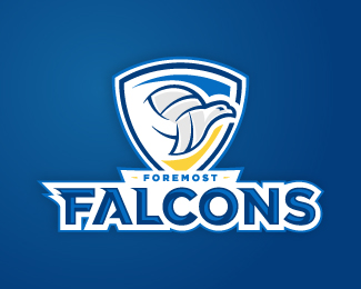
I think it's good, at least better than it was before. As for me:
Reply1. I'm not a big fan of strokes, though they are a common thing in sport logos.
2. I also think it could be better to separate the type and the emblem.
3. I love the details you've added to the type, but the mark is more dynamic visually. How about italics? Just my three cents :)
Hey, David. In average ordinary shipping takes about a month! )
ReplyI love the type, but can't help seeing a sea turtle instead of a falcon. Perhaps, since falcons have large eyes, there would be opportunity to focus on the head and use the volleyball within?
ReplyPlease login/signup to make a comment, registration is easy