Description:
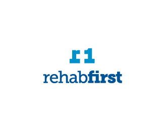
Recently finished project for a company in Texas. The negative space forms a health cross. However, the lower part of the cross is about 10% longer to subtly go with their desire to have some symbolism to support the importance of their faith in Jesus Christ.
Copyright Josiah Jost and Siah Design © 2010
Status:
Client work
Viewed:
5112
Share:





Lets Discuss
Goodness gracious Josiah! work for me.
Replynnnnnicceee
ReplyThanks Gents :)
Replyclean and nice
ReplyThanks Ivan. I hope to blog more about the process on this logo on my site later. I felt I needed to develop some icons to accompany the mark for their different fields.
ReplyDid you see this?**http://www.logofaves.com/2012/01/one-plus-one/
ReplyThanks, for the heads up, PerfectBlue!
ReplyPlease login/signup to make a comment, registration is easy