Description:
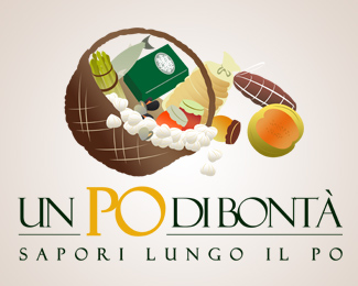
Logo made for a new traditional products line. We tried to do something that would give an idea of movement. The basket subject has been imposed by the client.
As seen on:
http://www.unpodibonta.it
Status:
Nothing set
Viewed:
1310
Share:
Lets Discuss
Nice design, surely fitting Italian traditions... I'm not sure about the effectiveness of repeating the Po word, maybe better another claim (%22un fiume di sapori%22 - hey you gotta pay me royalties for this! :-p)
Replytoo busy... how does it looks like when it's smaller?
ReplyYou wont believe, but even smaller it looks very cool. Thanks for suggestions!
ReplyPlease login/signup to make a comment, registration is easy