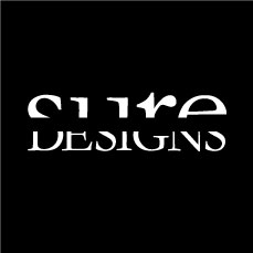
sure DESIGNS
by Sandhya • Uploaded: Oct. 17 '07

Float
(Floaters:
4 )
Description:
This is my personal logo. Sandhya U Rao. I love colors and hence unable to decide on a particular one. Feedbacks and suggestions welcome. This one is the updated one.
Status:
Nothing set
Viewed:
4583
Share:
Lets Discuss
The colors look nice together.**I don't like how you cut them both off though. You can tell what it says, but it makes you pause for a second, and not in a good way.
Replyi read pure design on the initial preview ... ok ... one too may and no idea why ...
ReplyI love to play with type and wanted to go with a mark that was purely type rendered. I liked the idea of cropping the letters in such a way that the eye still reads the 2 cases individually as well as a whole. **@wheedwacker: You said it makes you pause, but not in a good way. I take the thought that it made you pause itself as a good thing :) Personal style is like an acquired taste. **@kaimere: care to explain what- %22one too may and no idea why%22 means. thanks!
Reply@climaxdesigns: will sure give that a shot! thanks!
ReplyNice work! Also, I agree with David. %22more of the word sure needs to be seen%22
ReplyHey, I love this piece of art.*The cropping did work for me, initial letters are cropped in such a way that it makes it completely readable (letter %22S%22) and it becomes easy to understand the word %22SURE%22.**When people get involved in solving a puzzle, makes you a winner, and it's a sure shot winner for me
Reply@thomas %26 climaxdesigns: the logo has been edited.**@cre8ive: thanks for your feedback, its good to hear that :)
ReplyI think 'said' has the right idea. The concept is nice. Also, the cut out (black area) inside the 'e' in 'sure' might look better if the base of it was flat.
Reply@miya: you official name is %22said%22 here. hehehehe! you got to sign up in here as well for your name to pop up.**thanks for you feedback. i m going to work on it and will upload options on a white background as well.**@OcularInk: Thanks for you comment. I get what you mean with the counter space. Kinda sticks out like a sore thumb now, cos everything else is straight.*
Replyyou sure design well!
Reply@raja: thanks :)
ReplyI love the colours you have used here, they attracted me right away and I had no problem reading the words within the design...nicely done!
ReplyKind of brings me back to Prince's Sign O'the Times video, with all the floating type. (Ground breaking at the time) I read the Sure well enough so generally I like it, but for some reason I see it as an Interior Design logo rather than Graphic Design.
Replythanks for your comments :)
ReplyIts more readable in your thumbnail image which is all white text on black background. I love how the type fits together and yet is still recognizable as two words...genuis!
ReplyMany thanks, Logolove. I have gone with keeping it simple and all one color as well. But retained this one here cos of all the comments that I have got :)
ReplyHi Sandhya, I went over your logos here and I really like some of them. I currently need some urgent help in designing a logo. Please let me know if you are interested and I will be happy to share more details. Apologies for posting this as a public comment. Do let me know whats the best way to get in touch with you. You can write to me at crvin@rocketmail.com . Thanks and keep up the good work!
Replyhas this been updated?.. i read sure designs without a problem!.. cool
Replythanks Nido! Its not been updated, but i have stuck to one color with everyone's feedback from here :)
ReplyPlease login/signup to make a comment, registration is easy