SO #3
by SamDeMastrie • Uploaded: Jan. 27 '15 - Gallerized: Sep. '15


Float
(Floaters:
20 )
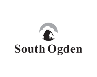
Description:
Another SO option. Do you see the hidden gem?
Style inspired in part by Jerron Ames.
Status:
Unused proposal
Viewed:
10180
Tags:
home
•
house
•
clouds
•
scene
Share:


Lets Discuss
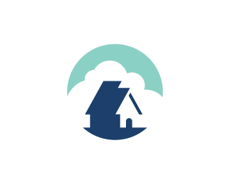
From 3 OS logos , for me this is the best , the colors , simplicity , harmony...
ReplyBut the only thing i dont like about this logo is the door of house , with the door house looks like a kennel , maybe if you remove the door , modify or maybe adding windows
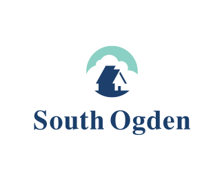
Thanks for your opinion, Sam. I tried the windows, but it makes it too complex. Also, I uploaded a couple of new variations. I tried a smaller, rectangular door and I increased the size of the mark in relation to the type. Better?
ReplyYes the rectangular door it's way better ,
ReplyBecause in the logo all angles of house are rectangular , only the door was round and this was the reason why the house seemed like a kennel. Now i like the logo more :)
I knew this was yours ;) Great work Sam!
ReplyThanks @formalelements and @secondseight. It's great to see this in the gallery. Thanks to whomever put it there. I'm disappointed this went unused, but at least I made these awesome stickers: https://instagram.com/p/7lm3KKvl3D/?taken-by=samdemastrie
Replyis this for sale?
ReplyPlease login/signup to make a comment, registration is easy