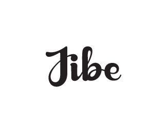
Jibe
by SamDeMastrie • Uploaded: Feb. 06 '13 - Gallerized: Oct. '13

Float
(Floaters:
31 )
Description:
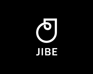
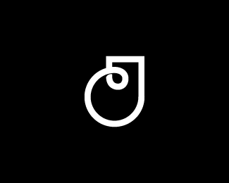
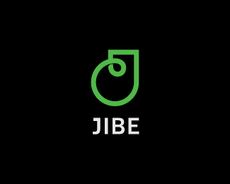
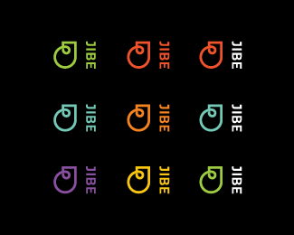
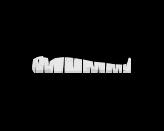
Jibe is undergoing a complete rebrand. "For over a decade Jibe Media has positioned itself as a highly capable branding and creative execution shop in the Salt Lake City market."
The new brand should communicate the following perception attributes: Powerful, Classic, Playful/Energetic.
Unique selling proposition: "Exceptional branding and creative solutions plus a proven strategic resource for modern marketing success."
Status:
Unused proposal
Viewed:
7086
Tags:
black
•
demastrie
•
sam
•
monogram
Share:

Lets Discuss
How about a dot on the vertical of the 'J' that would co-incide with the vertical i?
ReplyUpdated. This is in the top two logo options now.
ReplyGreat solution Sam.
ReplySome people's orientation IS to read from top to bottom, others [myself included] prefer bottom to top. This is with regards to the vertical JIBE type. In my humble opinion, the JIBE beneath the mark works better.
ReplyAm loving the simplistic nature of the mark though, and looking forward to seeing where you'll take it...
looks great Sam ... love the color alternatives
ReplyThanks for the love everyone. This went unused. See the chosen design here: jibemedia.com
ReplyI think your logo looks better :)
ReplyVery good, Sam!
ReplyI think your logo as it is looks gorgeous, I'm in love with it.
ReplyPlease login/signup to make a comment, registration is easy