Description:
hotel chain
Status:
Client work
Viewed:
16247
Tags:
house
•
hotel
Share:


Lets Discuss
the drawing process :) http://youtu.be/DDeoGy9b-dw
ReplySergey ... amazing work ... float and fave !!
Replythat's cool!
ReplyThanks!
ReplyWhat's wrong with the text in the comments?
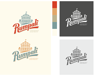
WOW. Sergey, I've been following your sketch development on Dribbble, and I've been waiting to see the final execution. This logo looks great! I love the typography, and the upward slant is really dynamic. Great colors, too!
ReplyLovely!!!
Replybrilliantly done. A testament to working from sketches. Thank you for sharing such great work with us.
ReplyMasterfully done!
ReplyAmazing, Serg!
Replyooo yeah
Replylooks vintage
ReplyNice vintage design!
ReplyLove all the elements of this composition. Great subtle shadow on the custom type and the whole vectoring process was fantastic.
ReplyBeautiful!
ReplySolid stuff!
ReplyOTLI4NO!)
ReplyGreat composition and colour.
ReplyNice one sergey! :)
Replyamazing work, great color!
ReplyThanks, guys )
ReplySergey, where is this hotel chain based? This design & typography feels very 'Italian,' and it even has a very Italian-sounding name.
ReplyAwesome work:)
ReplyJon,
Replynot in Italy, in Russia
MIND BLOWN
ReplyI really like this one! Lovely typography.
ReplyPlease login/signup to make a comment, registration is easy