Description:
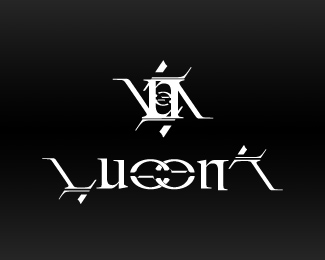
Lucena is an up and coming music act. I designed the art for the album. This design was proposed for the logo, and may yet be used even though it did not make it onto the album cover.
Status:
Nothing set
Viewed:
1464
Share:

Lets Discuss
Impossible to read it.
ReplyDo you have any suggestions for improvement? Which elements are the most difficult for you to read, and which are easier?**You feedback is appreciated.
Replyall the letters are impossible to read! if i didnt know it said 'lucena' i wouldnt know what it said! id think it was some ancient babylonian... thingy-bob! try making it simpler, without all the additional strokes %26 dashes?... see what it'd look like then?
ReplyThanks for the feedback. It looks like I have more work to do on this one before it is easily read by others.**When I get the chance, I'll post a revision.
ReplyPlease login/signup to make a comment, registration is easy