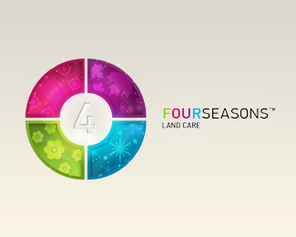
Description:
Logo design proposal.
Colour version of the logo.
As seen on:
Status:
Unused proposal
Viewed:
2108
Share:
Lets Discuss
Nice! I think that in a smaller version of the logo, the %224%22 is hard to see.
Replystrange summer ))
ReplyFirst of all, as dansandub said, the '4' is difficult to see, and in my opinion, not really necessary. It puts the emphasis on the %22Four%22, where it should really be on the %22Seasons%22 bit, considering it's a land company.**Also, the colours could do with a bit of tweaking. The bottom too are good, as they are the colours associated with that season. However, I would suggest maybe yellow for summer and red for autumn. This will give you red, yellow, blue (the three primary colours) and green (probably the most primary of the secondary colours, if that makes sense).
ReplyPlease login/signup to make a comment, registration is easy