Description:
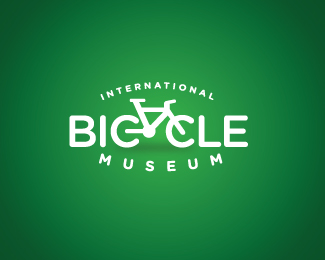
An environmentally friendly and informative bicycle museum identity.
As seen on:
Royal T
Status:
Client work
Viewed:
11188
Share:

Lets Discuss
I like the pictogram style of the bike.
Replythat's brilliant..very creative solution, well done!
ReplyCool concept. Unfortunately, the %22Y%22 doesn't really work as the bicycle frame. I like the overall style though.
ReplyLove the execution. But, I agree with sdijock. 'Y' doesn't really come out but I guess, it's very much implied. Kudos! :)
ReplyThanks for the comments thus far... the Y wasn't supposed to be a literal implication but more so an implied reading.
ReplyI've been lucky and read it from the first time (or maybe the symbol helped me). I think is clever, it's a pity that is confusing for some of us (and being a museum that it's addressed to everyone a safer / classic solution might be in order).
ReplyI read it right away, but then again, I think in pictures.
ReplyAn idea-- what if you added a kick-stand to serve as the bottom part of the 'y'?
ReplyVery nice work, cutie pie!
Reply%5ENice suggestion Chad!
Replyvery conceptual..
ReplyPlease login/signup to make a comment, registration is easy