Description:
for myself, although I realize raster based graphics will scale and read better, I am experimenting with including my paint style here
Status:
Nothing set
Viewed:
1169
Share:


Lets Discuss
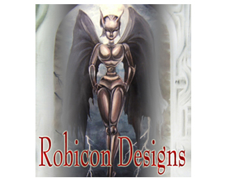
This could develope into a logo, but atm it's just an image with some type on it. Sorry.%3Cbr%3EHow about cutting out the angel and using it with some interesting typo? And I'd prefere a more dynamic figure, thats not just walking around, but has some more movement and tense in it.
ReplyI agree with gstalig. It's looking more like a book cover than a logo right now. You're definitely a creative person, now all you need to do is come up with something less illustrative, simpler and more iconic.
ReplyOops. I didn't realize it posted as a logo....perhaps I should have pointed out this was a failed attempt at posting an avitar, it really was not intended to suffice as a logo. But thank you for your comments just the same, I will have my logo design up shortly. And thanks gstaltig, perhaps I could even use the figure and rework it to make a mark out of it, I will give that some thought.
ReplyPlease login/signup to make a comment, registration is easy