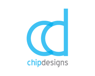
Chip Designs
by RobTaylor • Uploaded: Jul. 13 '09

Float
(Floaters:
0 )
Description:
My new business logo. Company does web design, logo's and more.
Status:
Unused proposal
Viewed:
1865
Share:


Lets Discuss
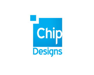
I like this layout best of the bunch. I think the chip itself, the line that is, should be further from the letter C. I think it reads as a crack, even a flaw, in your business. Also, I don't think the use of multiple typefaces works here. Get rid of the Helvetica, it's not as interesting. IMO.
ReplyHi Chirp, thanks for your feedback, i found it bery helpful. I have since amended the design so that the chip has been set back towards the left which has made the 'chip' smaller, kept all the font the same (blue highway if you wanted to know) and moved the text 'design' under the icon to keep everything sqaure and emphasize the chip icon.
ReplyPlease login/signup to make a comment, registration is easy