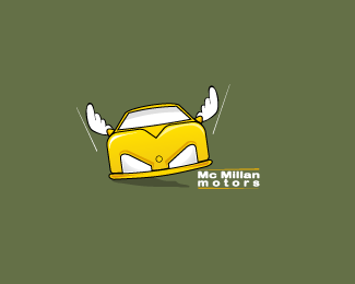
Mac Millan mod
by Rincon • Uploaded: Sep. 09 '09

Float
(Floaters:
4 )
Description:
now the type is bigger to make it more noticeable.
thanks guys for your opinions.
can see the old one at:
http://logopond.com/gallery/detail/76849
Status:
Nothing set
Viewed:
1488
Share:


Lets Discuss
Geez, don't take this the wrong way but the first thing I see is Road Rage, like someone just got cutting someone off in traffic and they're flipping the guy the bird. Even though technically it's not the middle finger. Maybe it's just me seeing that.
ReplyNaah, I see it too. Kerning is a little off too%3B I think 'Mc' and 'Millan' are parts of the same name, but are too far apart compared to the spacing of all other letters in that name. :( Sorry, Rincon.
Replythankx guys anyway, lets try another type, maybe could work better
ReplyPlease login/signup to make a comment, registration is easy