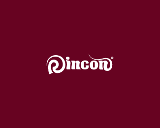
Rincon
by Rincon • Uploaded: May. 15 '10

Float
(Floaters:
26 )
Description:
my personal mark with some changes in the color and font
Status:
Nothing set
Viewed:
3346
Share:


Lets Discuss
Nice logo man!
Replythanks, It%B4s been growing up
Replythanks for the floats, appreciatte it
ReplyAnthony, I always liked your mark, I like what you did with the type but I think the burgundy color was more impactful, was stronger in my opinion, good job in any event.
ReplyNice, AR.
ReplyThanks Rudy and Joe, just trying to make it better. appreciate your feedbacks
ReplyNice work really, I saw your other works you really very gud.
Replythank you Vickyviraj
Replyvery nice job, nice natural flow to it.
ReplyI'm glad to hear that from U mcdseven
ReplyWell done. plus float
ReplyGreat mark AR!
ReplyPlease login/signup to make a comment, registration is easy