Float
(Floaters:
0 )
Description:
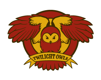
An idea for an indie band. Focus was on the owl in the T shape.
Status:
Just for fun
Viewed:
1925
Share:


Lets Discuss
The illustration isn't too bad, kind of like it. But if you want to have the owl stick out as a %22T%22 maybe try taking the circles away from the background.*Also I would give the type a little lovin'. the arch doesn't match the ribbon. You have something here, just a little cleaning up. Just my opinion though. good luck.
Reply%5EThanks for the input. Agreed, some more playing needed.
ReplyPlease login/signup to make a comment, registration is easy