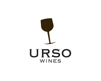
Float
(Floaters:
28 )
Description:
Practice - Urso means bear
Status:
Nothing set
Viewed:
10728
Share:





Lets Discuss
getting a little tippsy there? cuz **u r so... drunk. ***I like it
Reply...also like the bear face too. very nice
ReplyI see the bear. I like it.
Replyvery cool, nice job cake_sama!
ReplyNice man! Althought it kinda does remind me of this Bar logo... http://files.coloribus.com/files/paedia/print/part_20/203626/preview_600_397.jpg**But still, nice work! The angle of the glass gives it so much more emotion! :)
Replyi clearly see a bear snout, very clever.
ReplyThere is A LOT of potential for this idea. PLay around with it some more. you are definitely onto a real winner!!
ReplyVery clever mate:)
ReplyI would reduce the proportion of the image to the text. otherwise its a memorable logo!
ReplyNice job but the proportions need work and the type could be better.
ReplyThanks guys :)
ReplyI love this one, great work
ReplyFinally found you. I've been searching for ths logo forever. I made the mistake of not adding it to my favour when I first saw it. I've seen many try to execute this concept but none has untiziled the negative space like you have. Superb!
ReplyPlease login/signup to make a comment, registration is easy