Float
(Floaters:
14 )
Description:
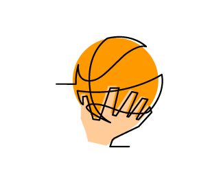
Trying new style, logo for a foundation dealing with basketball, thoughts?
Status:
Nothing set
Viewed:
1631
Share:


Lets Discuss
Cool style. Not sure about so much overlap of lines on the hand. Feels a bit muddled. But very nice style.
ReplyLove the continuous line
ReplyYea also love this style found a %22tut%22 on the internet :P Will look at that hand, thanks guys
Replycool lemon
ReplyHow did this one miss my attention? ...Loving the line on the ball Cake, although the hand could use a little smoothing out. The background colouring is an especially nice touch :)
ReplyPlease login/signup to make a comment, registration is easy