Personal Branding
by Reghardt • Uploaded: Nov. 15 '08

Float
(Floaters:
3 )
Description:
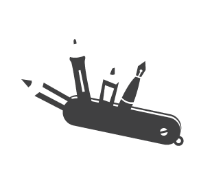
Concept for personal logo I can actually live with, suggestions?
Status:
Nothing set
Viewed:
1340
Share:


Lets Discuss
*Tools positioned oddly in handle? The pen looks flat and is hard to read IMO. Cool concept, flush it out a bit. What other %22tools%22 do designers use?
Replyyou could work more on the tools, make them realistic.
ReplyI like the concept, but like joder %26 Matheus both said,*they look flat and not realistic. The positioning of the pen %26 pencil.. are you trying to achieve a readable %22V%22 ? if not then more tools are required my friend.
Replyokay cool, thanks guys now i have something to work on
ReplyPlease login/signup to make a comment, registration is easy