Float
(Floaters:
2 )
Description:
Company who sells high-end lightadvertisements on buildings.
Status:
Nothing set
Viewed:
10798
Share:




Lets Discuss
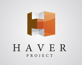
Climax I think that you are totally wrong. The font shows its high end. and the building does represent light from how glossy it is. this is a complex but very clean logo. good job.
Replythe mark is too heavy for this.. too much weight...
ReplyI agree with Climax and Nido. This is too heavy for the typface chosen and alignment presented here.
ReplyI like the icon but I see a disconnect between the icon and type type. You should experiment with different typefaces for %22Haver project.%22 And adjusting the placement of the icon will help get rid of the %22heavyness.%22 Very unique though.
Reply%22looks like you did the 'h' and then tried to tie a building into it, but i don't think it works, not from a technical standpoint, but what does the side of a semi-transparent building with an upper inset mean in terms of what the company does. %22%0D*%0D*It's not a building. It is a 3D 'H' because those advertisements and displays are always in 3D. The transparency is there to show the light/shadow play of the acrylic used.%0D*
ReplyPlease login/signup to make a comment, registration is easy