Canadian Orebodies
by Raja • Uploaded: Jan. 13 '09

Float
(Floaters:
20 )
Description:
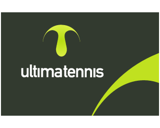
Canadian Orebodies Inc. (TSXV:CO) is a junior natural resource exploration and development company with its mineral properties located in Canada.
The logo was inspired by the crystallization of minerals forming the maple leaf of the Canadian flag.
As seen on:
http://www.canadianorebodies.com/s/Home.asp
Status:
Nothing set
Viewed:
6468
Share:


Lets Discuss
Love the idea behind the mark Raja. Not sure about the type placement.
ReplyThanks, Roy. It would be nice to post some experimental logos and have all the freedom. Most of the time I post what the client decided on, and many times it's not what I feel is the best.**How are things with you, keeping busy?
ReplyI know what you mean - the experimental ones are always the easiest %3B)*V busy but not on logos unfortunately :(
Replyis it a bird?... is it a plane?...
Replynido, you need to travel more
Replythe mark is unbelievable..
ReplyVery clever Mark memorable and very Canadian
ReplyThank you for looking!
ReplyHi Raja**I really feel that you're one of the best logo designers on Pond. I, however come from the old school. I really worry about the amount of gradients you use on most of your logos. Your ideas are truly brilliant! But with those gradients, consider the costs in reproduction.**CHEES!!!
Reply@ ColourBash - It's not gradients that cost money when printing, it's the amount of colors you use (CMYK and/or spot colors) and the paper stock you've chosen. And if raja's clients buy off on a colorful logo design and are willing to pay for it what's the issue? As long as he sets the logos up properly, chooses the right paper stock and uses a reputable printer there shouldn't be a problem reproducing the gradients.
ReplyBeautiful Raja! Congratualtions!
ReplyHi Black ColourBash - I can see your concern and I certainly appreciate your praise. However, thus far, thankfully, I have not had a single printing issue with over 1000 clients. I'd have to totally agree with sdijock's insight (thanks dude).**Thank you Thomas!
Replyso is it a bird.. or a plane??
Replyor a locomotif
Replyits obviously superleaf!
ReplyNice Raja!
Replythanks, nima....Thanks Jason, been awhile since I seen you on here - how's it going?
Replynice one - the return of raja ....
ReplyGreat Mark Raja!!!!
Replythanks Mike!**oronoz, and thisGuy, thank you too**I put the original background I had back on.*
Replygreat design raja veer...*hav been gettin inspirations from ur designs....n gt to kno abt u frm ur website...%3E*congrats n best wishes...*
Replythank you, gjathoul
ReplyPlease login/signup to make a comment, registration is easy