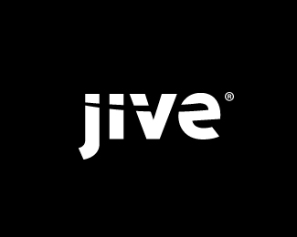
Description:
We are really excited about this one. I collaborated with Mike Erickson (http://logopond.com/members/profile/showcase/679) and under the direction of Sam Lawrence (http://gobigalways.com/) and Mike Sigler (http://www.siglerdesign.com/) we came to this solution. You can learn more about it here, http://www.jivesoftware.com/community/blogs/jivetalks/2008/02/18/jive-gets-a-new-logo#comments . Thanks for looking!
As seen on:
http://www.jivesoftware.com/
Status:
Nothing set
Viewed:
21263
Share:


Lets Discuss
that was a lot of name dropping - but it was a team effort and should be noted!
ReplyName dropping to say the least. %22I would like to thank the Academy, The Clique, Adobe CS3 Illustrator, and everyone else that I have forgot!%22. HAHA! It turned out great guys!
ReplyVery simple. Very nice. %22iv%22 kerning is a little loose
ReplyHi Raja,**Well I don't want to disagree with the whole committee :) but the first thing I thought was: %22why does the cut-through stop?%22 It would still be readable even with a line all the way through it, a la:**%3Ca href%3D%22http://metaeducation.com/logopond/jive_logo_2.png%22%3Ejive_logo_2.png%3C/a%3E**And extending the 'j' hook a little might be nice too. :)**Regards,*met%26aelig%3Bducation
ReplyOooohh... I like it!
Replyclever result :D
Replyi like that the cut through stops. to me it gives the logo more dimension.
Replynice! but with the %22e%22 a bit tilted, i would have tilted the %22j%22 as well just to see :)
ReplyThat logo took a LOT of effort and I'm ecstatic. It really was a team effort and despite the dreaded %22design by committee%22, I think it turned out great. I really appreciate all the work Raja and Mike put into this. As a designer I found it very hard to take on the role of the client. Huge thanks to everyone who worked on this. :)
ReplyThis turned out really nice. Great job, guys!! It's almost as if the cut through the letters was meant to be there. Now that takes some skill.**Would you please scale logo down now? It's suffocating.
ReplyHmmm... well I'm just concerned that cutting only one side of the 'v' makes the v look like it has a dot. To me, the time it takes to fill in the concept of a meteor flying through the neck of the 'v' doesn't seem to pay off the consequence of anyone being jolted by %22jii/e%22. Cutting both sides makes the eye take for granted that it's being %22swooshed%22 all the way across.%0D*%0D*(However, after looking a little longer I decided I did like the unique shape of the 'e' which is surprisingly readable... so I retract the idea of cutting through the right side of 'e'!)%0D*%0D*For balance, I note that it's already the case that each of the 'v' and the 'e' characters are as individually wide as the 'j' and 'i' put together... so having even more area filled on 'v' downplays the %22ji%22 further. (Given this disparity, I truly think giving the 'j' a little more width is worthwhile, because %22ve%22 is dominating right now.)%0D*%0D*So just to see, here I've cut the 'v' on both sides and widened the hook of the 'j':%0D*%0D*%3Ca href%3D%22http://metaeducation.com/logopond/jive_logo_3.png%22%3Ejive_logo_3.png%3C/a%3E%0D*%0D*Though if the fly-through is non-negotiable, yet I were able to pick the left side of the 'v' being cut vs the right side, I would want to cut the right. I think it pushes the weight to the center and distributes it better, and I like the look almost as much as cutting both sides of the v... but I'm still a bit jarred by the %22dotted v%22 phenomenon:%0D*%0D*%3Ca href%3D%22http://metaeducation.com/logopond/jive_logo_4.png%22%3Ejive_logo_4.png%3C/a%3E%0D*%0D*Regards,%0D*met%26aelig%3Bducation
ReplyI don't see anything wrong with the 'V'. It's 100%25 legible. If someone can honestly look at this and tell me they don't see the word Jive, than maybe. But I doubt it.
ReplyMeta, I find your need to take someone's work and edit it yourself offensive to my sensibilities as a Creative Director. I've seen you do this with this post and a number of others that I've seen. It's particularly odd that your name itself has the word education in it. A balanced educator knows that %22giving guidance%22 is far better than %22doing%22 for someone. And personally, I'm not comfortable with someone's unsolicited hands-on participation in my client's brand. It's an arrogant gesture IMO. But of course that's just my %22unsolicited%22 opinion.
Replymeta, its a great logo I think you're looking into it way to much.. its nice though to see the input .. gthobbs - if you don't like this don't have the logo posted here, logopond is all about showcasing a logo and having it ripped apart %26 praised.. say whatever you want to say about the logo.. as fellow designers we very much struggle with jealousy and although we deny it, I see it all the time.. designers that have superiority complexes and all that.. but really don't admit it. Best thing we can do is say job well done, that logo looks killer and move on. That jive logo looks dece, my fave part about it actually is the slight grey shading and black bg.. that style is in and its sweet looking. So props to the designers, lets all just view this and get inspired to create more cool logos.. after all this is fun stuff %3B)
ReplyIt's not my logo matty. I welcome criticism. I think meta goes too far when he takes the design, manipulates it, then reposts it. IMO.
ReplyI agree, he does and I would naturally be offended if he did that with any of my logos that were finalized, done and signed off.. now if it was a logo in the development stage - different story. Still judging by logos he has done - I still wouldn't take his opinion for anything IMO because I personally think hes not a good designer at all, no talent. Just my opinion.. Anyways, fact of the matter is this JIVE logo looks great.
ReplyTotally agree with every point matty. And I love the Jive logo original.
ReplyThis is excellent. I like the way the slice is interrupted. The metallic effect I can take or leave but otherwise excellent.
ReplyI feel this is one of those logos that can stand the times. It's simple enough, yet unique and memorable. As far as things we could have done, well been there, done that. Kudos to all involved.
ReplyMan, I really dig all the feedback, good and bad. I agree that the metal is a bit on the trendy side but I really couldn't help myself. Apologies to Raja and Mike if I went a bit far with that. :P**I completely agree with Mike (Logomotive) that this logo was meant to be timeless. We were very conscious of making it trendy and I think our caution really paid off.**I put up a more thorough breakdown of our process. I hope I gave enough props to Raja and Mike. Like Raja said, it was a huge team effort.**http://siglerdesign.com/index.php/site/article/the_design_of_jives_logo/
Replyvery eye catching. good job!
ReplyI think it needs to be BIGGER!
ReplyLOL Mike**This logo is now featured in the Feb' edition of Entrepreneur Magazine under the title of Five Great (and necessary) Marketing Makeovers
ReplyBravo Kudos Raja :-)
ReplyKudos to you Mike!
ReplyKudos to both of you. Looks great on the site too.
Reply... and kudos to me
Replykudos to nido and Tonfue too!**%22mag cover%22:http://rajasandhu.com/images/ent-photo.jpg*%22title%22:http://rajasandhu.com/images/ent4-photo.jpg*%22blurb%22:http://rajasandhu.com/images/ent3-photo.jpg*%22blurb 2%22:http://rajasandhu.com/images/ent3-photo.jpg
ReplyCongrats Raja! :-)
ReplyCongrats, this is really cool. **Consider selling autographed copies of the magazine on the ebay :-)
Replyvery encouraging Raja... seeing as I may be getting laid off this week!.. :(
ReplyVery cool guys!**Nido what happened?
Replythanks fabian-**Nido, what? you working for Ford or something?
Replyhttp://www.entrepreneur.com/magazine/entrepreneur/2009/february/199650-3.html**%22link to the online article%22:http://www.entrepreneur.com/magazine/entrepreneur/2009/february/199650-3.html
Reply**%22link to the online article%22:http://www.entrepreneur.com/magazine/entrepreneur/2009/february/199650-3.html
Reply:-) cool. BtW my name is spelled wrong Rajja.
Replysowwy!
Reply*%22Nice to see Jive Software progressing so fast%22:http://www.techcrunch.com/2009/10/19/jive-raises-12-million-for-social-enterprise-software/**Logo could not have been done with out the help of Logomotive.*
ReplyAmazing logo Raja, congrats, very nice indeed.
ReplyThanks Rudy, you rockstar!
ReplyHey raja, that is really cool news. glad to hear they are doing good.
ReplyI mean Raja %3B)
Replyyes you mean, very mean!
ReplyWow. You nailed this one.
ReplyHa I just looked at metaeducation's folio and all I can do is scratch my head wondering.
Replyhaha you crack me up Mike!
ReplyHehe. A classic case of talk the talk but can't walk the walk.
ReplyRaja, I think you should reduce this by about 50%25 for presentation. ?
ReplyI agree with you and think you are always right
ReplyMike - I just checked the project folder - it's on my old machine. Since it was your touch that made this logo - you must have the source file?...send it over if you don't mind, or send the JPG with your presentation eye?
Replyre-sized for you ME
ReplyJive Software went public today, opening the bell on NASDAQ. Such an amazing story to watch and be lucky enough to partake in. Does not get any bigger than this for the entrepreneurial journey. WOW!**http://www.forbes.com/sites/tomiogeron/2011/12/12/jive-software-prices-ipo-at-12-per-share/
ReplyGrats! Raja and nice resize :) cool stuff.
ReplyCongrats Raja!*sounds as though this would have been a great project and then to see it grow, would be an awesome trip to involved in.*And it sounds like Mike E (logomotive also gets some congrats.) what a team.
ReplyNice logo Raja*And congratulations:)
Replykudos man.
ReplyMikeymike, seeing clients succeed is the reason I still do this, it's what pushes me to deliver a solution that actually improves the bottom line -- and working with logomotive Mike, as you can imagine was a very fun because he shares the same tenacity.**Mike, Mikey, sbdesign, yhanktou - thank you for the comments!
ReplyPlease login/signup to make a comment, registration is easy