Float
(Floaters:
8 )
Description:
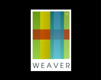
identity created for new home decor company. Still developing a type treatment.
Status:
Nothing set
Viewed:
5471
Share:





Lets Discuss
Great concept!
Replyawesome. I think the TM can float next to the mark. For me, it takes away from the mark when it's forced into it.
ReplyNice Raja...this is a very interesting mark.
ReplyI think this would be more efficient without either the last or the first vertical bar as it does not add much to understanding the concept.
ReplyNice :)))) Have you thought of a monochrome version of this?
ReplyThis is a beauty, lovely.
Replythis shi- is bananas!
Replyraja, while I like this, I cannot understand why you did not weave a %22w%22 into the design, you know the %22raja%22 touch. Ya keep us thinking bro nice job.
ReplySlick design. I'm also curious about a woven 'w'.
ReplyThis is hot.I to think this is begging for the RAJA touch!
Replylol - this is just a simple abstraction, no hidden gems. Thanks for the comments
ReplyIt's nice nevertheless. Great colors too.
ReplyPlease login/signup to make a comment, registration is easy