Turkey
by RaitG • Uploaded: Jun. 07 '13 - Gallerized: Jun. '13

Float
(Floaters:
34 )
Description:
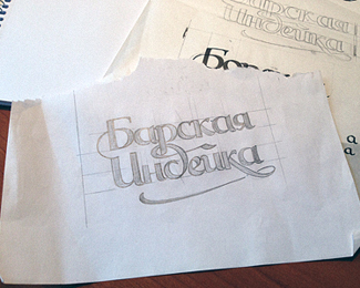
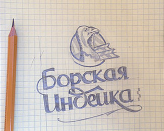
Steel working on a logo
Status:
Work in progress
Viewed:
7157
Tags:
letters
•
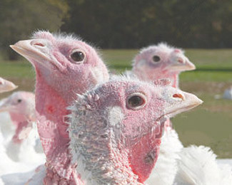
farm turkey green ecology
Share:


Lets Discuss
This is pretty awesome, RaitG !
ReplyOtlichnaya indeika!
ReplyType and Signs it's my old work)
Replyladygrey thanks
i love it!
Replymateoto thanks, still working to make it more simple
Replygood job i like
Replywhoswho thanks
Replycongrats bud ... b&w looks great too !
ReplyTAS thanks) just want to keep it simple
ReplyI thought it was a dinosaur at first
Replydownwithdesign thanks
Replyperhaps this is due to the shape of the beak?
I think so. The main thing that throws me off is the bottom jaw jutting out and the eye. I don't think you need as much detail in the neck area as it kind of makes it look more muscular like a large mammal. Sorry to be so blunt, I just saw the 'actively seeking critiques' and thought I'd offer my first impression. It may just be me though.
Replydownwithdesign this is very useful for me (WIP)
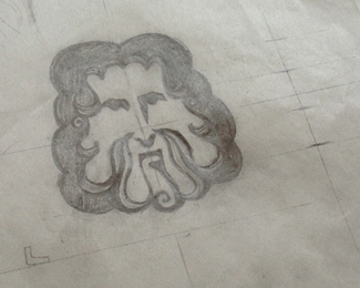
Replyadding to Gareth comment, maybe some details to the back of the head so that you imply there are some tiny feathers there, like they are in the picture you put there, also the shape of the head could be changed to be more like in the picture, as the curve on the back-top could be much more smoother...hope this helps, cheers!
Replylove it :)
ReplyPlease login/signup to make a comment, registration is easy