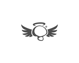
You know, OcularInk brings up a great point: a halo with this would be better. Still think the wings are best with this one, also the name works best here too. Musheaven! :)
Nicely illustrated. I liked the royal shroom typeface. It felt a little lighter because you are talking about heaven afterall. Have you tried spacing the letters out a bit :)
%3Cb%3Emuse7%3C/b%3E thanks for opinion. Yes, I tried spaced them differently but then type is starting over powering mushroom so you need to scale down typo which then is hard to read in very small sizes.

Lets Discuss
Musheaven, as 'shroom is often used in slang for psychededlic mushrooms. Unless that's what you're going for, of course... :)
ReplyPlus, this one looks better, in my opinion. Better execution, concept, and overall graphics work.
Reply%3Cb%3EJF%3C/b%3Ethanks for your thoughts
ReplyYou know, OcularInk brings up a great point: a halo with this would be better. Still think the wings are best with this one, also the name works best here too. Musheaven! :)
ReplyHalo is now in the place :)
ReplyThis is AWESOME. Great job! I positively love this. Fabulous!!
ReplyThank you again guys.
ReplyNicely illustrated. I liked the royal shroom typeface. It felt a little lighter because you are talking about heaven afterall. Have you tried spacing the letters out a bit :)
ReplyI like it with the halo - nice one Radek.
Reply%3Cb%3Emuse7%3C/b%3E thanks for opinion. Yes, I tried spaced them differently but then type is starting over powering mushroom so you need to scale down typo which then is hard to read in very small sizes.
ReplyThank you very much %3Cb%3EChris%3C/b%3E .
ReplyI love the type with this, btw. Nice balance -- size, style, all of that. Just my two cents on it.
ReplyThis is cool too!
ReplyThanks again!
Replycool! :%3E
ReplyGreat!
ReplyThanks!!
ReplyPlease login/signup to make a comment, registration is easy