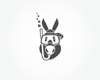
Sea Donkey
by RadekBlaska • Uploaded: Jun. 09 '09

Float
(Floaters:
4 )
Description:
Logotype for Sea Donkeys Dive Club.
Goal: funky, funny feel together with circular shape was required as logo will go onto diving equipment and rubber stamps.
Status:
Client work
Viewed:
5899
Share:


Lets Discuss
I love the illustration. I don't think the type lives up to it.
Reply%5E agreed!
Replyalso agreed
ReplyI agree unfortunately dive club didn't :(**It is not easy sometimes especially when not just one person but whole club have to be satisfied. *Next time will upload logo first and let them see what great designers like you guys think about it!*Thanks*
Replylove the idea of sea donkeys!
ReplyThanks %3Cb%3Eindiaskapie%3C/b%3E
ReplyNice illustration.**Could you not have 'Sea donkeys' on the upper part going from left to right then dive club.com on the lower part going from right to left...if you know what i mean? Like this http://logopond.com/gallery/detail/33878
ReplyThanks for comment %3Cb%3Eeziemac%3C/b%3E.*I know what you mean and agree they were just so unbelievably keen to make type so big even if I tried to explain.*Will upload different version just for my %26 your piece of mind :)
Replyperfect
ReplyThank you Giedrius.
ReplyPlease login/signup to make a comment, registration is easy