Description:
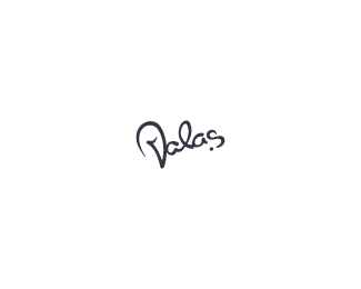
This is second prototype of redesign for very talented web designer Martin Valas. Still working on it. It is based on Martin's own signature.
As seen on:
Valas.cz
Status:
Work in progress
Viewed:
2351
Share:


Lets Discuss
I like this version better than the first. The simpler V makes a better statement and is less cluttering. The other V looked like it was supposed to be a pictograph almost.
ReplyLooks good, but at first glance I've read Dalas.
ReplyThanks for comments guys
ReplyPlease login/signup to make a comment, registration is easy