Description:
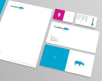
twogether: an independent creative agency. Strategically-driven.
Media-neutral. Technology-minded. People-inspired.
Our aim was to tell our brand’s story with a bold, clean, clear (and sometimes quirky) look and feel. We also wanted to convey our new vision, which is all about building relationships: between us and our clients; between our clients and their customers. “twogether” neatly encapsulates this.
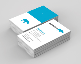
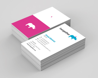
Besides, a big blue rhino and tiny pink bird look kinda cool, right.
As seen on:
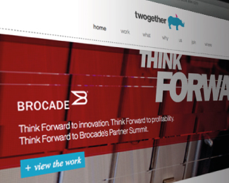
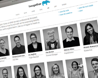
www.wearetwogether.com
Status:
Client work
Viewed:
8970
Tags:
graphic
•
simple
•
pink bird
•
blue rhino
Share:
Lets Discuss
im trying to find some adjectives how i like this but i ll just say its the best i ve seen in a long while. simply thx for sharing and great job with this!
ReplyIn the small size I saw it as a shark fin on a rhino.
ReplyI saw the same as Luma but, this is nice. :)
ReplyFunny... just presented something similar a week ago to a client... they didn't go with it either. Some people just have a thing against Rhinos and Birds... together.
ReplyReally nice concept and branding job. Afraid to say that at a smaller size, I also saw a shark fin on a rhino.
Replylol Nido. Made me cackle... like an old witch.
ReplyNido
ReplyI was just browsing animal vectors - http://www.123rf.com/photo_14660586_cool-silohuettes-of-hippo-giraffe-and-rhino.html
ReplyYour Rhino looks identical.
Please login/signup to make a comment, registration is easy