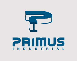
Float
(Floaters:
0 )
Description:
Industrial Company.
Mark is of an I-beam with the 2 letters P + I.
Status:
Nothing set
Viewed:
2375
Share:


Lets Discuss
took me a minute to see the beam after I read the description. now that I see it, I think it is pretty cool, but the first thing I saw was a question mark. I still see a question mark.
ReplyHey PK, IMO it will be much stronger if you take this concept and square off the angles.
ReplyDiscovery's %22Project Earth%22:http://www.discoverychannel.ca/Showpage.aspx?sid%3D13179 uses identical P treatment for the type. Nice mark though, I-beams ftmfw :-)
Replyepsilon, are you frikkin kiddin?
ReplyAhem .. if edges are squared off, the P's will be identical. That's P in the text, not in the mark.
ReplyYet another very irrelevant post.Dude you want people doing that to you?
Replyum, I'm with Logomotive. yeah, the Ps are marginally similar. I would not have even thought to mention it.
Replymike, you not seeing the point doesn't make the post irrelevant. **Specifically, if you watch Discovery Channel, you notice that they had a major push for this Project Earth show and all ads in rotation featured the logo of the show in a very prominent way (like 40%22 on 52%22 screen). And in the logo itself _the_ element you can't help but notice is the P. It's pretty much all that sticks to the mind from the logo. Therefore this specific rendering of P is already firmly associated with a high-profile show on a channel that has substantial viewership. How's that for irrelevant.**Also, going back to the exchange you and I had in your KnockedOut entry. The logo I linked to belongs to a highly visible (car tire) franchise in my neck of woods, which also IIRC has a lot of presence across Canada. For anyone living here your logo would evoke the association with that franchise and consequently the tires and dirty mechanics. Now do tell me that this information was too utterly irrelevant.**You really gotta stop taking my comments as a critique of a straight visual similarity. That stuff is trivial. Perceptual similarity is not. A logo may look only vaguely like something else, but it will end up borrowing from the emotions that are associated with another work. Good thing if both are related. Bad thing if they are not. Alen (Type08) asked me not to comment on his logos, because in one of them I saw something that he completely didn't expect. Fine with me, but in the end if I saw it, other people will do too. **I frankly think that the associations feedback is no less valuable than %22kern this, align that%22 while it is actually harder to come by. So to answer your question - yes, absolutely, I want people doing this to me too.**Sorry for the long post, can't really make it any shorter.
ReplyThere are tons of fonts out there with a similar/identical P-treatment, just have a look at some freebie sites, particularly in their %22Sci-Fi%22-sections. I really don't think that this capital P is seriously going to remind anyone of the Project Earth logo. That's a bit of a far fetched connection you made there.
ReplyYou originally said the Ps were identical. They aren't. I also watch the Discovery channel all the time and would never have made the connection. This logo is more than just the capital P of the text. It is the I-beam mark above that is critical. If he used a capital P without the openness and curve, it would look like 100s of 1000s of Ps out there. Seriously, you would you have made an issue of that, too?
ReplyPlease login/signup to make a comment, registration is easy