Description:
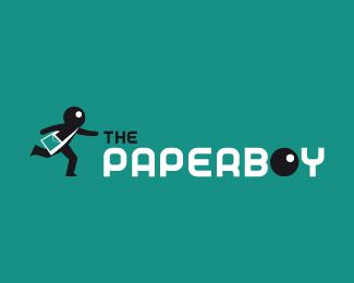
The Paperboy
As seen on:
www.prismaticstudio.com
Status:
Nothing set
Viewed:
1491
Share:

Lets Discuss
This has a nice stance about it. I really like the icon. Do you need to repeat the head as the 'O' in Boy? That seems forced and unnecessary. It looks like a pool ball or something. Just isn't making sense. Without it, this would be much stronger. Nice work.
ReplyThis reminds me of BiC:*http://content.answers.com/main/content/wp/en/c/ca/Logo_bic.png
ReplyPlease login/signup to make a comment, registration is easy