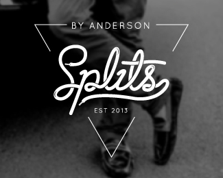
Splits by Anderson
by PinkCheeseDesigns • Uploaded: Feb. 20 '14

Float
(Floaters:
0 )
Description:
This logo mark created for Splits by Anderson - a high-street brand for the youth, plays with typography.
The USP of the product is laces on loafers which the logo highlights.
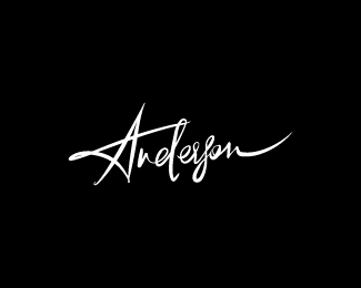
We also came up with a signature for Anderson as an alternate to the logo.
Status:
Client work
Viewed:
5886
Tags:
youth
•
shoes
•
triangle
•
typography
Share:

Lets Discuss
Please login/signup to make a comment, registration is easy