Description:
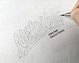
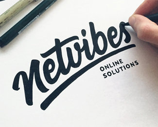
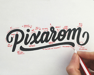
Custom lettering logotype for "Netvibes".
As seen on:
http://drbl.in/nkAc
Status:
Client work
Viewed:
6578
Tags:
font
•
type
•
typeface
•
logodesign
Share:
Lets Discuss
Nice typo!
ReplyLooks great
ReplyNice flow going on here.
Reply@vfolio & @flipaer Thank you!
Reply@Kevin, awesome to hear that from you dude. Had a struggle finding the right flow on this one.
Please login/signup to make a comment, registration is easy