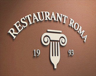
Restaurant Roma
by PIOTRLOGO • Uploaded: Dec. 14 '15

Float
(Floaters:
34 )
Description:
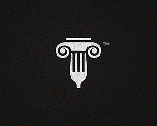
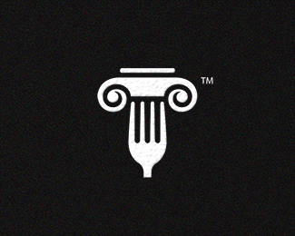
Restaurant Roma
As seen on:
Restaurant Roma
Status:
Client work
Viewed:
4193
Tags:
black
•
idea
•
piotrlogo
•
design
Share:


Lets Discuss
cool idea!
ReplyThank you Yuro !
ReplyThis sign is nice, I wonder if it would look better if the sides of a fork was parallel to each other :) Pozdrawiam!
ReplyThank you Logoflow !
ReplyGood work.
ReplyThank you Baluev !
ReplyThe mark is great but I feel like the type could do with some work. The curved lettering seems to make it unbalanced.
ReplyAlso, do you need that line at the top of the mark? At smaller sizes I saw a car on top of a fork at first. If you remove that it could make it look more like a pasta spiral?
ReplyPlease login/signup to make a comment, registration is easy