Overton's
by Overtons • Uploaded: Sep. 05 '08

Description:
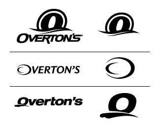
Overton's is the world's largest watersports dealer and are re-branding. Logo choices have been narrowed down to these three. Please critique these logos as much as you possibly can. Criticism of any kind is greatly appreciated, however the constructive kind is always better.
Status:
Nothing set
Viewed:
2373
Share:
Lets Discuss
Definitely, without a doubt, the top one. The typography is the best, the symbol of the 'O' looks the best. It's unique and powerful, love it.
ReplyAlso forgot to add, because of placement on some products, icon will have to be strong enough to stand alone as well as work with the logo as a whole of course.
ReplyHave to agree the top one definitely is the way to go.**Top version - Symbol in the first one holds up the best on its own. I could really imagine that on different products creating a strong brand. The type has a unique and custom feel to it. Most importantly it actually feels like a well put together logo.**Middle version - Too weak, especially when the symbol is by itself. I doubt it will hold up well on products at all. Middle symbol has a Quizno's feel to it. Type choice is poor, font is too plain and just looks typed out, nothing special about it. I read %22VERTON'S%22 and not Overton's in this version.**Bottom version - Font choice is also poor in this one. Again, just typed out and nothing special about it. Has a very amateur feel to it. Symbol alone is not very interesting.**Bottom two do not feel unique enough to be successful logos and are not very memorable. The top version stands out and just attracts attention.
ReplyOverton's... Really? I know Parker pretty well. Although, he sold the company a little while back. Pretty crazy story. I think it's exchanged hands a couple times since then. Glad to see it up here. **You from Greenville? (prob none of my business...)**As far as the logo is concerned. I'm in agreement about the top version. By far the %231 choice.
ReplyYeah, currently I live in Greenville. Went to school at PCC and now work in Overton's art department. As far as the logo goes, they decided to get a big agency involved and they came back with about 20 versions of the logo that all looked thrown together in about five minutes. I created the top version, but problem is they are getting opinions from people without any creative knowledge at all and those people seem to lean towards the middle one up there. I was just trying to get opinions from other creative professionals so I can try to steer everyone in the right direction. Thanks for your input.
ReplyG-Vegas baby... Me too. Small world.**God I hope your steering works... Good luck.
ReplyI am form Kinston and have shopped at Overton's for years. I will have to admit that I like the text version of logo %23 1.%60 However, since I know Overton's and know that it is a watersports store I definitely think that logo %23 1 is the best logo for the company. The 'O' of %231 is the strongest and it says watersports to me.
Reply%231 was definitely wat attracted my attention to take a closer look. The type is great and the icon is great. Nice one man!!
ReplyPlease login/signup to make a comment, registration is easy