Float
(Floaters:
12 )
Description:
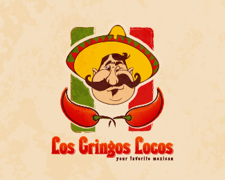
logo for a mexican restaurant
Status:
Nothing set
Viewed:
10700
Share:






Lets Discuss
This composition is really nice but atm each component is standing on its own. The Mexican can do with abit of makeover by thinning and thickening the linework where its needed so its not too clipartsy. Give the face some shading maybe and then I would rotate the guy approx 10 degrees clockwise. Make the chillis smaller and have them sit underneath but behind the guy's chin. By then the flag in the BG could be less stretched. And lastly but most importantly, text warp the name top and bottom, make it larger, and then centre the tagline. That should do it!**Sorry to sound arrogant but I just like the composition sooo much that I wanted to fix it myself! Cheers.
ReplyPlease login/signup to make a comment, registration is easy