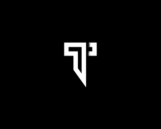
And you know, Nitish, if it's at all relevant, you could even squeeze in a "70" read in the icon by rounding out all the corners of the 7 and then instead of that little square shape to denote the rest of the T crossbar, you could use a skewed circle.
I think if you did that, the icon would read both "seven T" as well as "70."
Again, that's all, of course, if the numeric association to 70 has anything to do with this brand.

Lets Discuss
Bigger View
Replyhttps://dribbble.com/shots/2716870-Seven-T
Update.
ReplyWell update coming soon:)
ReplyI'm with David. The concept is brilliant, and the icon is well-executed and reads as (I assume) intended, which appears to be "Seven T" or "70."
ReplyBut the corresponding typography doesn't read that way. It reads as "sevent."
Perhaps a dash, bullet, underscore, or even a space between "seven" and "T" could help the read?
And you know, Nitish, if it's at all relevant, you could even squeeze in a "70" read in the icon by rounding out all the corners of the 7 and then instead of that little square shape to denote the rest of the T crossbar, you could use a skewed circle.
ReplyI think if you did that, the icon would read both "seven T" as well as "70."
Again, that's all, of course, if the numeric association to 70 has anything to do with this brand.
^The above suggestion might take a bit of manipulation to ensure that it reads as "70" and not "7 degrees."
ReplyPlease login/signup to make a comment, registration is easy