Cake or Death
by Nikolausj • Uploaded: Apr. 03 '10

Float
(Floaters:
5 )
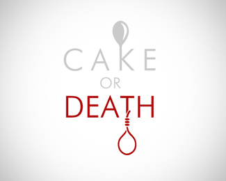
Description:
A comedy bit from Eddie Izzard.
As seen on:
365daysofdesign.org
Status:
Just for fun
Viewed:
1099
Share:
Lets Discuss
ahahaha*I LOVE Dressed to Kill. *%22YOU! Cake or death?%22*%22Uh, cake please!%22*%22Well we're out of cake!%22*%22So my choice is, or death?%22
ReplyClever. There needs to be more contrast in the %22cake or%22 as it is now, it appears a bit washed out.
ReplyThis is great! Maybe a few things to try.**1. Switch up the blood on the roller to the left so your eye moves back and forth from death to the blood instead of heavy on the right.*2. A slab serif like lubalin or rockwell might look really good with this. (watch your kerning on the %22c%22 and %22a%22)*3. To limit color usage (cause this might benefit from being a two color logo instead of 5), use a white stroke to infer the edge of the roller before the handles instead of darker colors to infer depth.**My two cents. I really dig it though!
ReplyPlease login/signup to make a comment, registration is easy