Description:
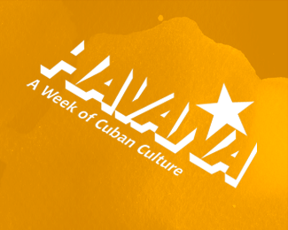
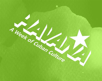
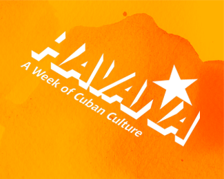
A university project called Havana, A Week of Cuban Culture. More can be seen on my website www.alexjcole.org
Status:
Nothing set
Viewed:
1006
Share:


Lets Discuss
This is a nice mark. I just wonder if the star should be skewed at the same angle as %22Havana.%22
ReplyI agree, the stars perspective is throwing it off.
ReplyThanks sirwilliamwesley, I agree with the star comment. %0D*However i wanted the star to stand out without just putting it somewhere obvious like in the middle of the 'A' which has been done a million times over. The angle it is at at the moment also makes the two tops of the letter 'N' more defined. I appreciate the comments its always good to get feedback.
ReplyPlease login/signup to make a comment, registration is easy