Description:
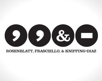
How better to handle the most verbose law firm name around by using its simplest elements? Well I thought it was funny anyway.
Status:
Nothing set
Viewed:
14484
Share:


Lets Discuss
Very non-traditional. It grows on me.
Replyi think this is genius!
ReplyI agree with the above comments :)
ReplyBrilliant! I love it!
ReplyI love it.*Good work
ReplyReally good concept! But I think scaling down the symbol would make it more elegant and less chunky as it appears right now.
ReplyGreat concept. Definitely brings you in with the punctuation elements.
ReplyWow, surprised by the response. I had much the same thoughts as a lot of folks here. I didn't like it at first, but couldn't get it out of my head, so I had to put it to paper and it grew on me. So I figured I'd let the good folks here set me straight.
ReplyGreat idea, Needles. I might be worried about the scalability of the logo as a whole, but nevertheless, nice job.
ReplyThis is fun, great concept. I can it working as a bigger mark, then maybe develop an alternative treatment for the type when the mark needs to be scaled down. I'm really curious to hear what the client's reaction was?
ReplySorry for the delay in response, I'm stuck in jury duty. (how apropos) Anyway, as many of you have no doubt noted, this is probably too off the wall for something as conservative as a law firm, and the client certainly felt that way. There was a point where, after defending it for a bit, I figured, if you have to defend a logo so vigorously, it's just not going to work. So I moved on.
ReplyI just love this logo.*I love it so much that I would create some sort of company with more partners just to use it %3DP**The concept is amazing. I'm interested to see how would you scale down the logo.
ReplyBesides the proportions this logo is brilliant.
ReplyA lot going on here?
ReplyPlease login/signup to make a comment, registration is easy