Sparetime (v.2)
by NEXQUNYX • Uploaded: Jan. 04 '09
")
Float
(Floaters:
1 )
Description:
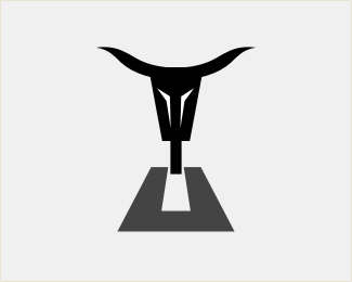
Revised version.
Adapted Mike's suggestions. Thanks:)
Here is the original version.
Status:
Nothing set
Viewed:
3615
Share:


Lets Discuss
Patrik, not there yet IMO. Think more like your Awesome piano logo.*1 Try solid black everywhere even on the tires on the jeep. Your looking at a straight angle so solid would be best here. I think you need to go slightly thicker on the outline around tire and make THAT tire have tread or knobbies. *2. the type needs to be downplayed IMO does not quite match that %22jeepie%22 feel maybe slab serif or just a nice beefy type? Make a mark, not a graphic.
ReplyGotcha! Back to the drawing board:) Thanks Mike.
ReplyRevised:)
Replygetting there....email me.
Replycertainly getting there... email Mike
Replywow! you have so many great logos!!!!!!!
ReplyPlease login/signup to make a comment, registration is easy