Description:
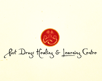
I have to say I really like Logopond and I envy many of the great ideas I see here consistently. What I've got here is my real first attempt at logo design and I would greatly appreciate any critiques.
The concept is: creating a brighter future
for drug users with a visionary approach of caring by harnessing their natural energy through
compassion, love, and respect combined with traditional Eastern medicine.
Status:
Nothing set
Viewed:
2526
Share:
Lets Discuss
nice... i really like the look %26 feel of this one...
ReplyFirst time my a%24%24,with logomarks like that I find that hard to believe.Just kidding mate,that's a very nice mark..one thing thou the P should be larger.
ReplyThe balance of this is throwing me off a bit. Maybe it's because the name is so long?%0D*%0D*Did you try running the name around the circle already?%0D*%0D*Or shortening the name to just the first letters?
ReplyThanks for the comments guys.**@Craven91: I think the emblem is a little off centered towards the left and that may be what's throwing you off. But yes, it is a long name. I haven't tried wrapping the name around the circle, but I think that would be very difficult to read, especially with the font used.
ReplyPlease login/signup to make a comment, registration is easy