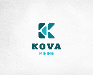
Description:
Third concept. Work in progressss (name is subject to change).
If you maybe seen similar logos somewhere, please let me know, THANKS!
Status:
Work in progress
Viewed:
1663
Share:



Lets Discuss
I think the layout could be a bit more interesting. I'd like to see KOVA to the right of the mark, but sharing the same baseline as the mark, reinforcing the implied surface level. MINING could still be centered or left-aligned below KOVA.
ReplyMe like this :)
Reply@Sam: Thanks for the constructive advice, I will try that option also...
Reply@Rudy: Thank you! :)
Please login/signup to make a comment, registration is easy