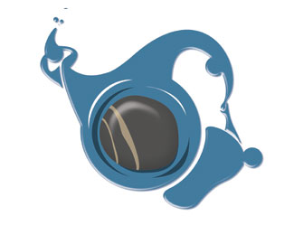
Rock & water
by MrMangoMan • Uploaded: Jun. 15 '12

Float
(Floaters:
1 )
Description:
this organization rock and water, offer self-control training. The logo implies that people should stand as solid as a rock but also as smooth as water
Status:
Work in progress
Viewed:
1257
Tags:
people
•
rock
•
water
Share:

Lets Discuss
the bevel/emboss and drop shadow take away from your mark try instead recreating those highlights with the pentool and using the pathfinder minus front feature on illustrator to create a nice sense of negative space :)
ReplyI actually love this; however, I don't think you are designing in vector (judging by the work you've uploaded so far). Are you? If not, that is a real problem. I like your ideas, but they aren't presenting as well as they should. This one in particular, I think it would flow better if all the water actually flowed together. That is my only critique really. Too much separation between water groups.
ReplySpeaking of which, of the three logos you have uploaded, the deMix is terrible. If you got rid of the gradients and shadows, it may present better.
@the artist,well seen that I mainly work with photoshop, I start to know a little better illustrator. Thanks for the advice!
ReplyPlease login/signup to make a comment, registration is easy