Float
(Floaters:
11 )
Description:
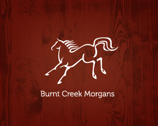
Logo for a breeder of Morgan Horses. CHANGED OUT THE BACKGROUND.
Status:
Client work
Viewed:
2220
Share:


Lets Discuss
Went back to original colors.
Replydamn good job mikey. only crit is the tail, doesn't seem to flow naturally like the rest of the horse, seems like the curves are of... could be though my eyesight is sh*t! I like it though.
Replythanks, paul. yeah it may be. the morgan has a thicker tail and i was also trying to get a feel of a creek or stream in the tail. :)
ReplyNice job. Maybe just 2 colors though, what do you think?
Replynice work Mike!
Replythanx for nice comments. appreciate it. yeah cerise, one color would carry it also. only went with two because i thought the horse stood out more, you may be right though, thanx 4 the suggestion. :)
ReplyLove this style, Mike. It's got a 'fountain pen' feel to it. Right on.
Replythanks, Simon. To be honest, I've always liked the way this turned out, becasue I did it about 20 years ago and all hand draw with the pen and cleaned up by hand. before computer for me. Always will like the hand done stuff. cheers and thanks for noticing.
ReplyPlease login/signup to make a comment, registration is easy