Description:
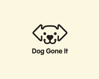
WIP. This is for a web site for non profit organization to help owners and lost pets reunite. Mark can be seen at, http://logopond.com/gallery/detail/121876
Status:
Work in progress
Viewed:
2560
Share:

Lets Discuss
How does this type fit this mark better? Just curious. Thanks.
ReplyBetter for this mark. Nice I see arrows as ears, heart as a nose and arrows forming the mouth. Mikeymike - Should this dog be a touch more excited having been found by his/her owner?
ReplyThanks, Ashley for the insight. gave the pooch a actual smile. took it up a notch, I think. Don't know how I missed that one. Thanks again.
Replynot loving this type. go with a simpler, sans-serif, maybe a bit rounded somehow (to compliment the shapes you have created there, mostly rounded)and yes, not italic, not oblique, not inclined. *but i love the mark and that small heart being the nose. memorable:)
Replyglad I could help :)
Replyright on, Ashley. love the advise one gets on this site. refreshing. working on type now. waiting on some client feedback also. thanks.
ReplyUPDATED. changed out the type to this one. nothing fancy, just smooth and rounded to let the image have a little more visual strength. What ya think?
Replybetter
Replythanks, Stelian.
ReplyPlease login/signup to make a comment, registration is easy