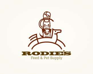
Description:
WIP.
Clients wants a western flare, but a little different twist. Thoughts? (Still working on it.)
Status:
Work in progress
Viewed:
2528
Share:
Lets Discuss
A bit crowded, but a really cute bunch of guys:)
Replyyeah, agree but the client was hoping to get the 4 main animals it handles, and takes pride in. Just tried to challenge myself to do it, but keep it fun. Hope I did that.*Cheers, Rokac. :)
ReplyI love the image.. I think maybe the type feels a little disconnected? Really like where this is headed. Always a fan.
Replythanks, Danny. client wanted a western feel to it, wasn't sure the images did it. may try another route. Thanks. Fan of your work too, my man.
ReplyHey Mike, I really like icon, and I realize the client wanted a western feel, but I agree with Danny%3B there's a bit of disconnect between the icon and the type. Have you considered exploring the idea of treating the whole image (icon %26 type) as a branding iron? I say this, because that's sort of the impression I get from the stylistic qualities of your icon. OR, the image could be stylized to look like it HAS BEEN BRANDED on something. One other nitpicky thing: I would maybe play with the stacked critters a bit to make it so that all the creatures have the same stroke thickness. That will make everything feel more connected. Right now the horse is very dominant. Keep going with this. You're on the verge of something really great.
Replythanks, for the insight, Jon. Yeah its still a work in progress. exploring other options also. I'll post if and when I get them to the point to show.
ReplyPlease login/signup to make a comment, registration is easy