Float
(Floaters:
3 )
Description:
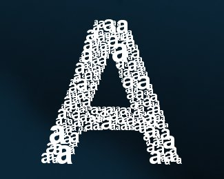
Logo for my new custom font.
Status:
Nothing set
Viewed:
3364
Share:

Lets Discuss
nice, but I think this is an overused idea...
ReplyLogo wise, i think i've only seen it implimented once before, and even then it was done differently.%0D*Again, the idea behind it is the font at hand. Logo for the font that will pretty much be of the same style, so all letters and numbers, pluss a few signs and symbols will be based on the same concept.%0D*Thanks for the comment :)
ReplyI'd love to see the complete font!
Replyshould have it ready by tom. Will submit it to dafont and such, link it here for you. Glad you like it %3D)
ReplyIs it not more logical to have lowercase %22a%22s representing a lowercase %22a%22 rather than an %22A%22 ?
ReplyNot really this is how i designed the font A lower case letter is made up of it's uppercase letter. :)
Replyand vice versa * i should have added.
ReplyA logo for a typeface.. that is a bit strange as a typeface should speak for itself really.*So you drew that %22a%22 letter did you? I do not comprehend why you would create an entire typeface just to reduce it to 10%25 its usuable size...
ReplyI really don't see why it's so hard for you to understand this, and you thinking having a logo for a typeface is strange, is completely your business and none of my concern what so ever. First, no, i did not draw the 'a', i went over it, editing a little where i see fit, but the original font i used was created by Gellan, a font artist and a good friend over at df and other well known font sites (yes, got his permission even though it is none of your concirn either). However, it's the concept of the font that i've created, where a single letter is made up of, it's smaller counterpart, as shown in the logo. It's a custom made logo, and i'm offering it for free on dafont and such. The reason i created the logo was to use it on my logs, sites, and on friends blogs, the type face does speak for itself, and for the amount of time and effort put into this unique font, im sure a logo is called for, at least in my opinion, and to be honest, that is all that matters :) Thank you for finding it in your heart to critique my logo twice, means...a lot, to me %3B) Thanks for the comment.
ReplyGreat idea. Now you should do it again and again for each character. Than we would have a great new typeface for big-size use. Where can I find it on dafont? link?
ReplyWOW! Must have taken forever to get all those little A's in there.
ReplyPlease login/signup to make a comment, registration is easy