Perfect Ice Option 1
by Mesha • Uploaded: Jan. 01 '11

Float
(Floaters:
0 )
Description:
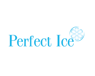
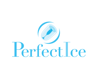
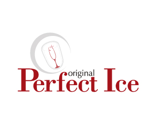
The form for this logo was created for a client who makes ice cubes of this particular shape. The inside hollow was reworked to suggest a wine glass. The small "t" of perfect and "I" of ice are combined to create a continuity. The old logo used a serif font. The client wanted some familiarity to the old one, Didot was used as it is an elegant yet light serif font, to invoke that.
Status:
Unused proposal
Viewed:
933
Share:
Lets Discuss
Please login/signup to make a comment, registration is easy