Description:
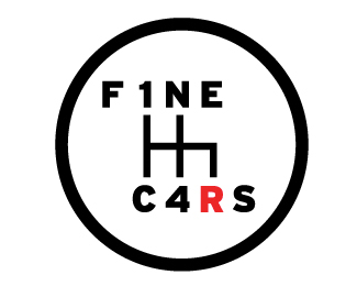
I created this logo for local company, Fine Cars, which is an established used car specialist in Guernsey.
Status:
Work in progress
Viewed:
2612
Share:
Lets Discuss
I like that the concept is both convincing and unforced. If you are still working on this, you could close the gap between the F and the 1. You might also decrease the overall font size in relation to the mark so it is at once recognizable as a gear knob.
ReplyHi Barry cheers for the comment, I agree with both of the points you made and the logo is still a WIP - yet to be shown to the client, so hope they like it!
ReplyCool idea, i'm curious for the end result
ReplyI like the concept too. Agree with Barry that the gap between the F and 1 needs to be closed up.
ReplyPlease login/signup to make a comment, registration is easy